1. About This Case Study
The Common Web Design (CWD) is the new presentation for the University of Lincoln's online services. Developed with HTML5 and CSS3 technologies, the University of Lincoln's Common Web Design enables rapid development of attractive, interactive and modern Web sites. Served from a content delivery network and optimised with speed, accessibility and progressive enhancement in mind, the Common Web Design also includes libraries for working with authentication, geo-location, and mobile content.
This case study will taking a look at how the Common Web Design came into being, design decisions, the underlying technological architecture and how it plays a fundamental part in our Web design toolkit, allowing us to develop rapidly effective and powerful Web sites and applications.
The Common Web Design (CWD) can be found at <http://cwd.online.lincoln.ac.uk/>.
Target Audience
The intended audience of this case study are Web site managers and developers working at Higher Education institutions who wish to explore some of the new features that HTML5 and its associated technologies offers. It will also interest practitioners looking for work-arounds for some of the situations they may encounter when working with the new technology.
What Is Covered
This case study addresses the following areas:
- History of the Common Web Design
- Use of HTML5 (and other modern technologies) in CWD3
- Implementation of the CWD for http://gateway.lincoln.ac.uk/
- Challenges
- What we learnt
2. History of the Common Web Design
In January 2010, the author joined the University of Lincoln's Online Services Team (OST) in the IT Services Department (IT). One of the first project activities was Posters at Lincoln [FN1], a repository and showcas for posters displayed around the University. This project, along with others, came out of a student focus group about improving student communications run by Marketing and IT.
At the time the author was also carrying out freelance work for the Careers and Employability [FN2] department and provided speculative design for a new corporate home page. This provided an awareness of the University's branding guidelines which led to work on a more modern design than the one used by the IT services department at the time.

Figure 1. Original, unfinished speculative design for a new corporate Web site.
Posters at Lincoln was the first of a number of Web sites due to be developed at the time by OST and we recognised that this was an opportunity to create a new presentation for our websites and services. Out of the speculative design we had worked on for the corporate site, we created the Common Web Design (CWD). This was dubbed version '2.0' because there had been a sort of common design before however it was a hack, and was only similar in terms of its colour scheme and placement of the University's logo.
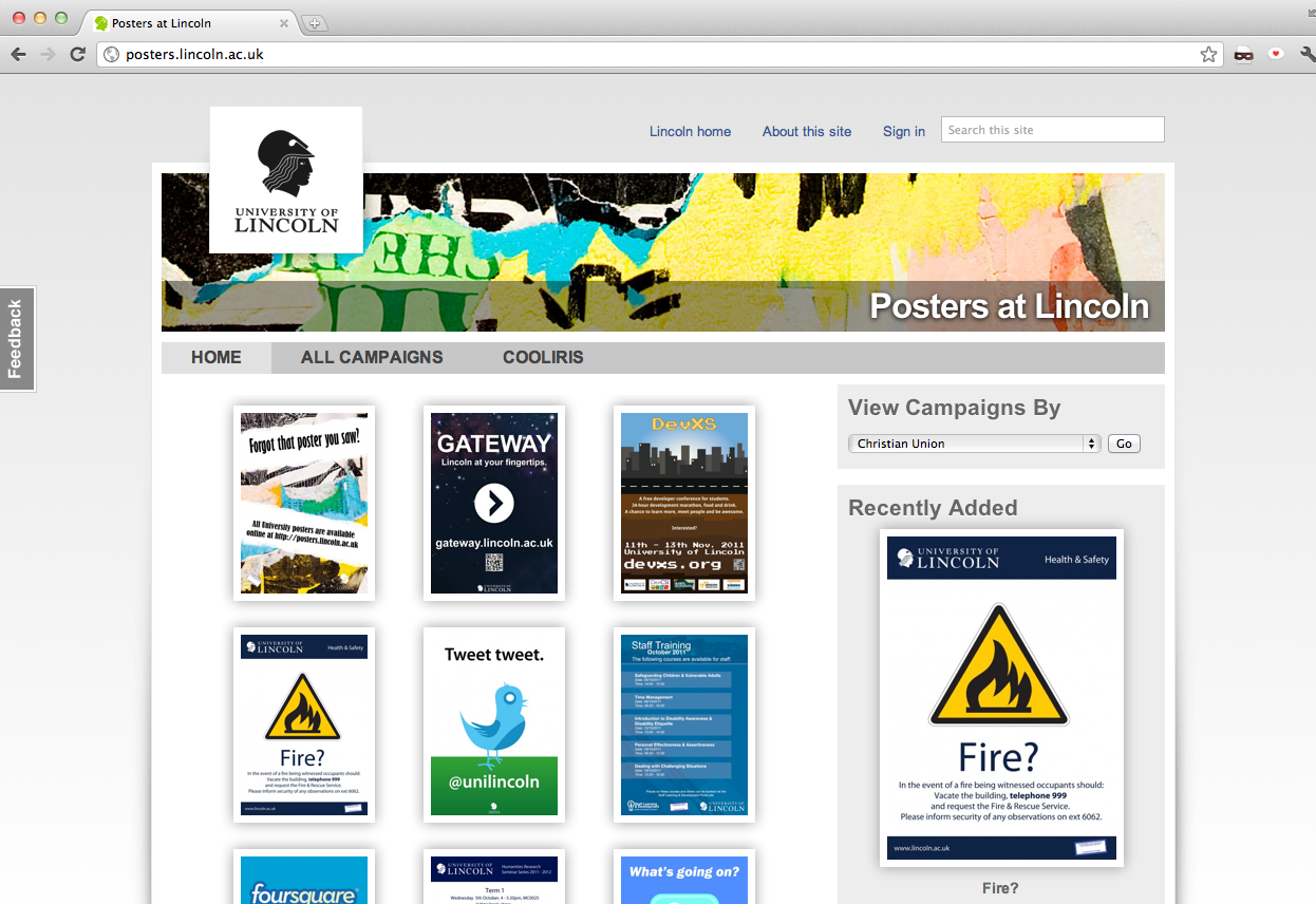
Figure 2. Posters at Lincoln was the first site to use the new Common Web Design
Over the course of 2010, this design was refined, introducing more features of the modern Web such as CSS3 and geo-location, and we worked hard on making the design render as elegantly as possible on Internet Explorer and even forayed into responsive design with a basic mobile layout for small-screen devices.
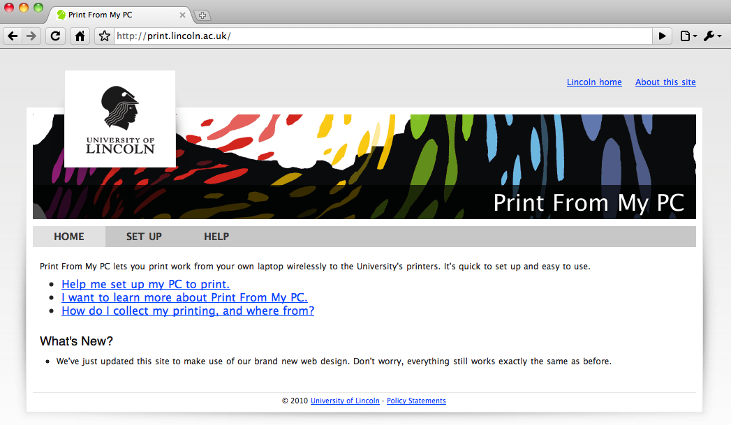
Figure 3. Print From My PC[3] was another early site to use the new Common Web Design.
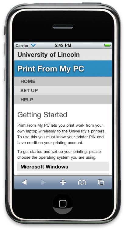
Figure 4. First attempt at automatic responsive web design using CSS3 media queries.
Over the course of 2011, the CWD 2 design was rolled out to about 25 Web sites and services. A WordPress theme [4] was developed which became the new default theme and is today used by hundreds of logs on our network.
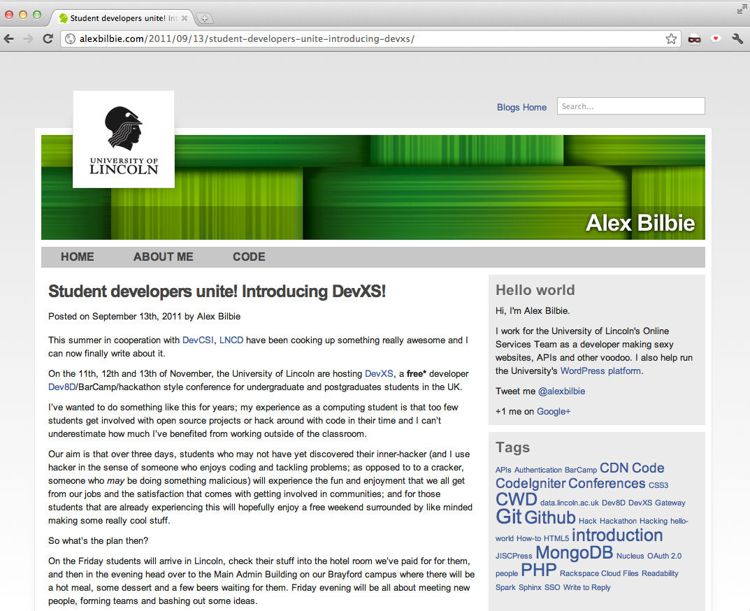
Figure 5. The CWD-based default WordPress theme, used here on http://alexbilbie.com/
We also rolled out three major updates to CWD2, v2.1 "Balblair"; which contained many bug fixes for Internet Explorer, v2.2 "Caperdonich" which introduced some CSS3 drop shadows, gradients and border images and finally v2.3 "Dallas Dhu" [FN5] which had a responsive design and introduced geo-location look-up and enhancements for newer browsers.
Our work on the JISC-funded Total ReCal Project [FN6] led to an exploration of alternative designs; one of the frustrating aspects of the CWD2 layout was that the content was contained in a box and it proved difficult to develop an elegant Web application in such a small space. Significant time was spent with alternative design which was inspired by the BBC's new GEL framework [FN7].
In early 2011, CWD v3.0 "Fettercairn" [FN8] was deployed which featured a brand-new responsive design, comprised HTML5 at the core, exploited new features of CSS3, worked in all modern browsers and was supported back to Internet Explorer 7. It had a flexible grid system that was not contained in a box, so the number of potential designs we could develop significantly increased, and had some impressive CSS helper classes to achieve beautiful, flexible and clean designs. Finally the accessibility of the framework was enhanced using WAI-ARIA attributes on the HTML mark-up while also developing guidelines for writing for, and designing, Web sites.
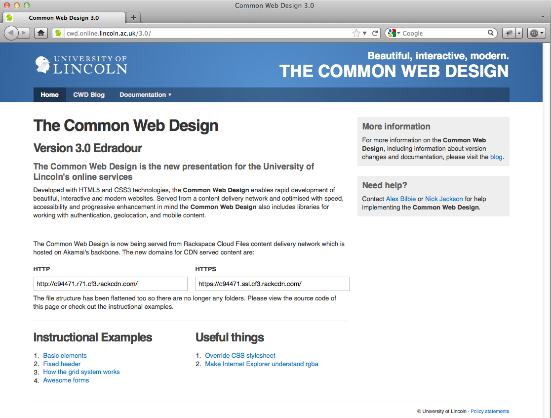
Figure 6. The Common Web Design v3.0 "Fettercairn".
Since the release of v.3.0 "Fettercairn" in 2011, Lincoln's OST has moved CWD3 to Rackspace Cloud Files [FN9] content delivery network (CDN) which uses the Akamai network. The CSS, JavaScript (JS) and images are served from a lightning-fast service with edge nodes across the world which makes an appreciable difference to the performance on mobile networks. It also adds very welcome redundancy to the framework because the CDN is distributed around the world instead of being hosted on a server internally.
Looking to the future, we will work on improving the accessibility with roaming display preferences. We will also connect sites to our future messaging framework (similar to Facebook notifications but across all CWD3-based sites).
One important aspect of the approach adopted with the CWD was that it was not designed for the lowest common denominator (i.e. IE 7, our corporate browser). Instead, we tried to push the modern browsers into showing off their new features, while ensuring that the design and features gracefully degraded when they failed to do so. Although none of the developers are trained designed, the CWD has enabled us to develop Web sites and applications rapidly, while ensuring they have consistent branding, a clean design, and browser compatibility and accessibility "baked in".
3. Use Case
Gateway [FN10] is University of Lincoln ICT Service's online portal to the numerous services we offer. The site regularly receives over 250,000 visitors a month, making it one of the our most accessed Web sites next to the corporate Web site [FN11] and our Blackboard installation [FN12].
Over the summer of 2011 we redeveloped Gateway from the ground up, making use of the CWD3, hooking it up to our single-sign-on (SSO) platform and integrating a number of our other services to develop a new site that was personalised, informative and modern.
There were a number of requirements for this new site:
- It had to work consistently across all the major desktop browsers including Internet Explorer going back to version 7 (which is currently our corporate browser).
- It had to be usable on a wide variety of mobile devices, not just smart phones, for example.
- The site should be personalised to the user
- It should display more 'useful' information than the current site
A decision was also made to host this new site externally, using Rackspace Cloud Servers, which offers:
- redundancy against outage in our internal server farms;
- a very flexible platform upon which to build; and,
- in the event of emergency on campus, Gateway can still broadcast messages.
4. Solution
When we developed the new Gateway site we made use of the CWD. The framework had a number of features that benefited us when implementing a site that needed to work cross-platform, cross browser and be accessible to all.
Media Queries
During its development, CWD3 was designed to work on both desktop and mobile devices. This was achieved by using 'reponsive Web design' principles, which include making use of CSS media queries and carefully constructing designing layouts so that block elements are appropriately positioned when the devices' screen size is adjusted.
At the core of CWD3 is a CSS grid system based on the 960gs framework. The grid allows for 12 columns of 62px width with a 20px gutter between each column. This grid [FN13] is an open source component so that others can make use of it.
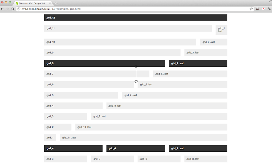
Figure 7. The CWD3 grid system.
Using media queries [FN14] (specifically crafted for mobile and table layouts) the grid is un-floated and columns take an equal width. With careful layout planning this means that if you have your main content in a column on the left and your sidebar in a smaller column on the right (see Figure 8), when the media queries are activated the content column (which is more important than the sidebar) will lie above the sidebar (see Figure 9).
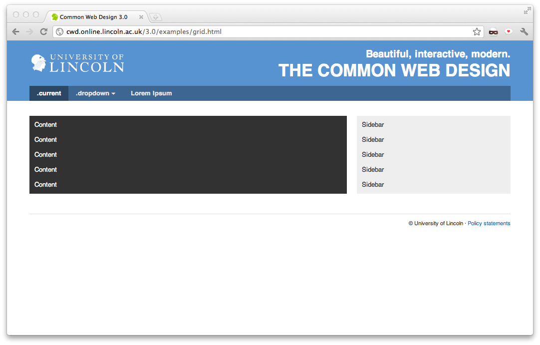
Figure 8. Desktop layout example.
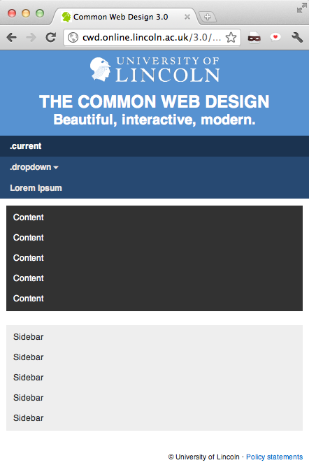
Figure 9. Mobile layout example.
When designing the new Gateway we made use of the two-third/one-third layout shown in Figure 9, specifically so this action would execute on smaller devices.
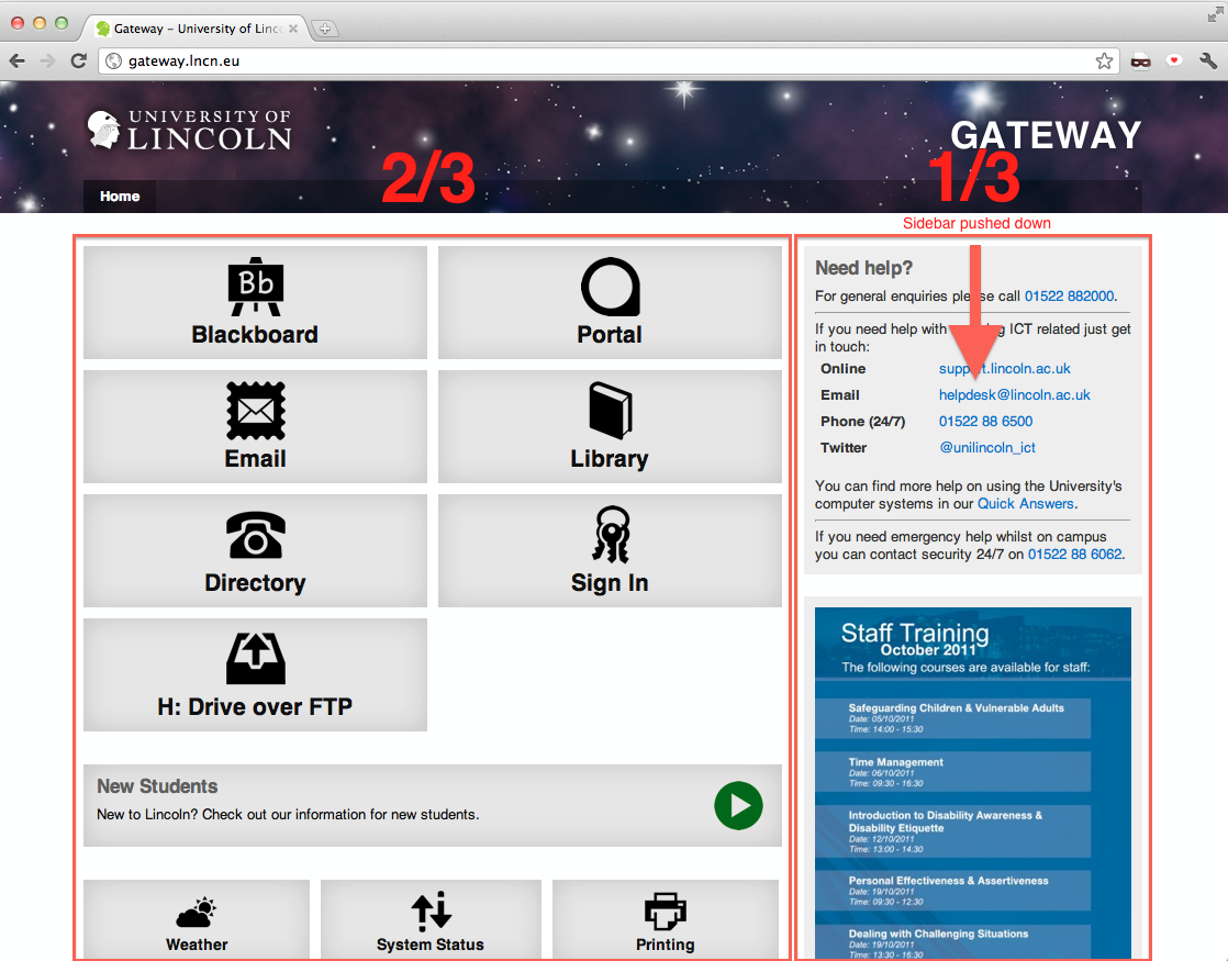
Figure 10. Screenshot of the Gateway
Figure 10 shows a screenshot of the Gateway with annotations showing the ?-? design and how the sidebar will be pushed below the main content in a mobile layout.
Thanks to thorough testing both by the original developers of 960.gs, and our own testing of the modifications we made to the grid system, the desktop layout works consistently in all modern desktop browsers mentioned above, and Internet Explorer back to version 7.
With mobile browsers it is a slightly different story. The site looks great on the iPhone's Safari browser (see Figure 11) thanks to its solid standards support. The Android browser renders the site almost as well, the only disappointing feature is that Android insists on using Droid Sans as its sans-serif font rather than Helvetica or Arial.
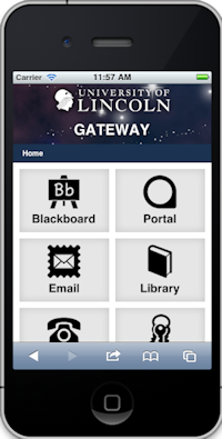
Figure 11. Gateway on iPhone.
The next most popular mobile browser, Opera Mobile "just worked" too, thanks to its excellent support of standards. Support for Opera Mobile is a big win because it is the most commonly deployed browser on "dumb phones".
Windows Phone 7 browser (at the time of writing the Mango update which introduces the IE9 rendering engine to the phone has yet to be released) does not support media queries. We therefore had to use JavaScript to detect smaller screen sizes and a class of "mobile" to the HTML tag which would then re-trigger the media queries and un-float the grid.
Blackberry 5 and 6 browsers have varying degrees of success, however thanks to the well thought-out semantic mark-up, both browsers render a basic but usable site. We have also been able to test on a number of other devices such as newer Nokia phones and a Samsung Taco. As with the Blackberry browsers, these render a very basic usable site.
Semantic, Accessible Markup
The CWD makes heavy use of the new semantic tags. The tag layout describes the semantic structure [FN15] of the site and this benefits users with less capable mobile browsers who will receive a logical usable layout.
For users relying on accessibility tools such as screen-readers, we've made heavy use of Accessible Rich Internet Application (ARIA) role attributes which further describe, in a standardised way [FN16], the building block of the page to help the tools appropriately contextualise the content. For example, the above top-level tag structure looks like this when you include the role attributes:
Personalisation and Messages
The CWD is one of three tools in our internal development toolbox alongside our Nucleus datastore APIs[17] and our Oauth-based[18] based single-sign-on (SSO) platform.
Users can sign in to Gateway which then personalises the main screen, for example displaying their library fine balance, and their print credit balance. In the future we will display other personalised content as we connect more university services to Nucleus.
Additionally once a user is signed into the SSO platform the CWD itself becomes personalised across all sites that use CWD3:
Visually, this helps users see that they are signed in, but this personalisation is part of a long-term strategy to develop a communications framework that will allow users to be informed cross platform (e.g. email, Facebook, Twitter), cross-device (e.g., mobile, desktop), and cross-site (any site using CWD3).
Part of the new Gateway's remit is to act as an emergency broadcast system and we developed a system dubbed 'Bullhorn' which displays a large warning message on Gateway when activated. However, Bullhorn also has an API to which we intend to connect CWD3; this will mean all CWD3-based sites can display emergency information when required.
Both the Bullhorn messaging system and the CWD personalisation platform currently use JSON-P calls. However, we have also been investigating the use of Web sockets [FN19] in order to be able to push messages out immediately to the more capable browsers.
Server Enhanced Geolocation
Our Server Enhanced Geolocation (SEG) platform enhances the HTML5 geo-location [FN20] APIs by attempting to determine users' location based on their IP address first. Consequently we spent considerable time with our network team establishing all of the internal IP ranges for each building, campus and wireless network of the University of Lincoln.
When the SEG is called, the user's IP address is captured and if we can match it against one of our internal IP ranges then we can immediately establish where the user is, and thanks to our Nucleus Locations datastore, we retain latitude and longitude co-ordinates for every building. If the user's IP fails to match one of our ranges, then we still try to approximate their location using Maxmind's IP to location databases, [FN21] which gives us an approximate latitude and longitude. Then if their browser supports it, we can narrow their location down further using the HTML5 geo-location APIs. When we have the users' location, we can then work out their nearest library and campus (if they are not already on campus) which means that we can then create "campus-aware" Web sites.
In terms of Gateway, our plan is to push out campus-specific Bullhorn messages (where appropriate).
Another advantage SEG confers is slightly more detailed site analytics because we can determine the University site on or close to which users are located. As a result, we can ensure that the information they receive is as relevant as possible to their current position.
5. Challenges
The biggest challenges, as with any major site, are testing across lots of different browsers and - as it is a mobile-accessible site too - devices.
Fortunately, testing desktop browsers has become increasingly painless as Webkit and Gecko teams are working hard on implementing new HTML5 standards in a consistent way. Therefore we feel that we are close to the point where we can code once and it will work anywhere.
When we designed the CWD3 we decided to end support for Internet Explorer (IE) 6 compatibility, because IE6 represents less than 0.1% of browsers visiting *.lincoln.ac.uk sites (in October 2011); the purpose of this design decision was to give us more time to devote to the test and debugging of the more frequently used versions of Internet Explorer.
A further decision was made only to support the most recent versions of the alternative browsers (Chrome, Firefox, Opera and Safari) because in our experience (based on our analytics), users of these browsers demonstrate a greater tendency to keep their browsers regularly updated.
6. Lessons Learnt
There is a wealth of guidelines, best practice, and tutorials available on the Web about HTML, JavaScript and CSS technologies, however there are a number of sites that really stand out in terms of the quality of advice they offer, including the Mozilla Developer Network [FN22] and HTML5 Doctor [FN23]. These sites proved invaluable during development, offering useful pointers and ways to overcome browser inconsistencies.
We also discovered a number of third-party frameworks and libraries that have eased the pain of development such as Modernizr [FN24], Respond.js [FN25]. The HTML5 Boilerplate [FN26] Project was useful as well to demonstrate current best practice across a number of different technologies. The advantages of using these frameworks and libraries are that they have been well tested and researched by hundreds, and in some cases, thousands of people.
Most of us are now using Mac computers which makes testing on Internet Explorer difficult. We tried using a number of different solutions for testing IE including using emulators under Wine [FN27] which proved unreliable and buggy and IE Tester [FN28] which works but does not always represent true rendering. In the end we set up virtual machines for Windows XP, Vista and 7 each with snapshots of the individual versions of IE available to it (i.e. for XP IE 6, 7 and 8, Vista IE 7, 8 and 9, and 7 IE 8, 9 and 10). It was a long process to get them set up but it does mean we can easily test combinations of OS and browser.
7. Conclusions
As an integral part of our toolkit, the Common Web Design has allowed us to develop beautiful, mobile-ready, University of Lincoln-branded interfaces to our rapid innovation projects in a short space of time.
Every element of the framework, from the mobile-ready grid system, the interactive user interface widgets, to the clean typography has been thoroughly tested across a multitude of browsers and devices, thereby giving us confidence in its use. Such rigorous testing means we can concentrate on creating great user experiences, instead of wondering if some great new design will actually work in Internet Explorer.
From the organisation's standpoint, the benefits are clear: anyone can easily create a branded Web site, application or blog. The framework's testing has reduced the number of problems reported to the ICT Support Desk from users experiencing problems in specific browsers. We are also encouraging the use of semantic accessible mark-up which has benefits in terms of search engine optimisation (SEO) and accessibility.